There is a rich and often contentious literature on the derivation of fraktur motifs. While Shelley explores the artistic roots and their relationships in “schools” of fraktur decoration (see “What is Fraktur”), Pastor Fred Weiser writes from the viewpoint of practical realism and emphasizes the joyful, colorful and decorative sense of fraktur decoration, expressive of Pennsylvania German character. From this viewpoint, reading too much into the designs is a mistake (Weiser, Piety and protocol, 1973). Read more on this on the page, “Are Fraktur Motifs Symbolic?”

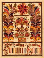
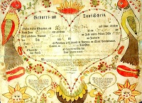
The traditions of the cultural group that produced a particular fraktur piece naturally determined much of its appearance and function. Lutheran and Reformed Pennsylvania Germans turned out many thousand Taufscheine (birth and baptism certificates), the wording of which was more or less prescribed while the surrounding decoration was open to artistic inspiration. Mennonites, on the other hand, are known for writing models (Vorschriften) and bookplates (particularly in song and copy books) that are quite calligraphic. Much Schwenkfelder work follows yet another style, marked by uniquely dense, colorful foliage and borders (left).
To the extent that groups such as these settled in a particular region or county, the fraktur work of the area tends to express their style. Thus, there being relatively few Anabaptists (Mennonites, Schwenkfelders) in York County, a higher proportion of fraktur from York is Taufscheine, whereas the Pennsylvania German settlements in Ontario, Canada are nearly exclusive Mennonite, with the accompanying Vorschriften and bookplates and absence of the Taufschein (Lloyd, 2001, p. 5).

Similarly, design preferences naturally grew within distinctive settlements and were shared among fraktur artists who knew each others’ work. Thus, the three-heart design grew to be extremely popular in York County (Shelley, 1961, p. 98) and the work of artists in more remote Westmoreland County showed stylistic sharing (Brocklebank, 1986). Indeed, fraktur artists and students of the artists were often influenced by or copied each others’ work, making the tracing of stylistic lineage an exciting, albeit often confusing, game.
Much has been made of the alleged link between fraktur and medieval illumination, particularly in the fraktur literature of the late nineteenth and early twentieth centuries. In fact, the founding document of fraktur scholarship is entitled “The survival of the medieval art of illuminative writing among the Pennsylvania Germans” (Mercer, 1897). Much of this is romantic wishful thinking. Even Dr. Shelley probably is being very liberal when he says “fraktur is a revival of medieval illumination, not a survival” (Shelley, 1961, p. 22). As Pastor Frederick Weiser points out, “illumination” has a specific meaning that fraktur does not fulfill. There is no known direct route between medieval illumination and fraktur, other than the fact that manuscripts were preserved in the regions from which Pennsylvania German settlers came, among others. The general notion of surrounding text with embellishments may have been inherited but that applies to many calligraphic traditions.
There is probably more to be gained by looking at links between fraktur and the trends in calligraphy that were contemporary with it. Researched evidence seems to say that fraktur writing was influenced by Baroque calligraphy of the seventeenth and eighteenth centuries, as well as by inherited folk culture (Yoder, European background, 2001, p. 18; Hopf, 1972; Sommer, 1983, p. 292). Numerous sources demonstrate similarities in appearance between European documents and early fraktur in America. Yoder points out that European fraktur-writers were officials in local or regional government as well as clergymen and that they commonly drew fraktur script with elaborate flourishes (Yoder, The European background, p. 22). In America, the author of fraktur was more often the local school master who also served as church organist, Vorsinger (congregational singing leader) and/or neighborhood scribe, who also had access to standard copy books for calligraphers.

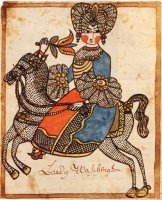
American fraktur changed in appearance over time as it grew beyond its European roots and responded to the cultural environment of the New World. Shelley and Moyer find that fraktur of the eighteenth century conveys the stiff formality of European manuscripts. Over time, the European look disappeared in favor of more use of color and free-hand drawings of plants, animals and fancy borders (Moyer, 1998, p.12). Valuing spontaneity and robust design, Moyer and other commentators identify the period 1790 – 1830 as the golden age of fraktur.
561 thoughts on “Fraktur Motifs”
Comments are closed.